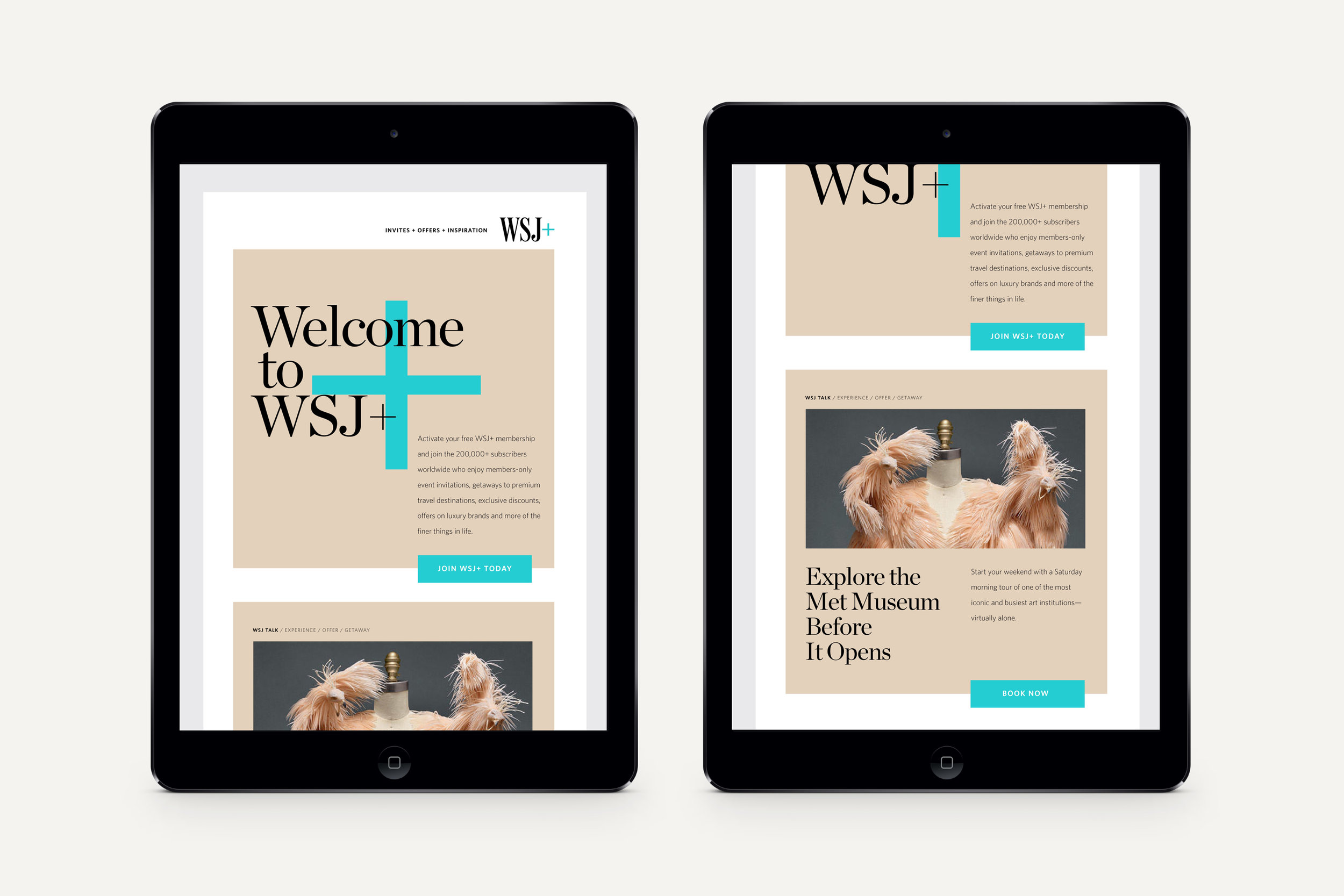
WSJ+
A brand refresh for WSJ+, a global membership experience exclusive to subscribers of The Wall Street Journal. We balanced a modern, editorial aesthetic through bold type, colors and layouts with the more traditional elements of the journal, like serif black and white typography, horizontal rules, a grid system.
Credits
Head of Art: Dan Beckett
Designer: Ceara Teixeira

Color. The color palette includes 7 pairs, where any pair from the set can be chosen for a given piece of WSJ+ collateral. This approach allows for flexibility in dealing with different types of content, while ensuring that all materials hang together. For something like an election event, the red and blue pair might be most appropriate, while something like a wine tasting might call for plum and pink.

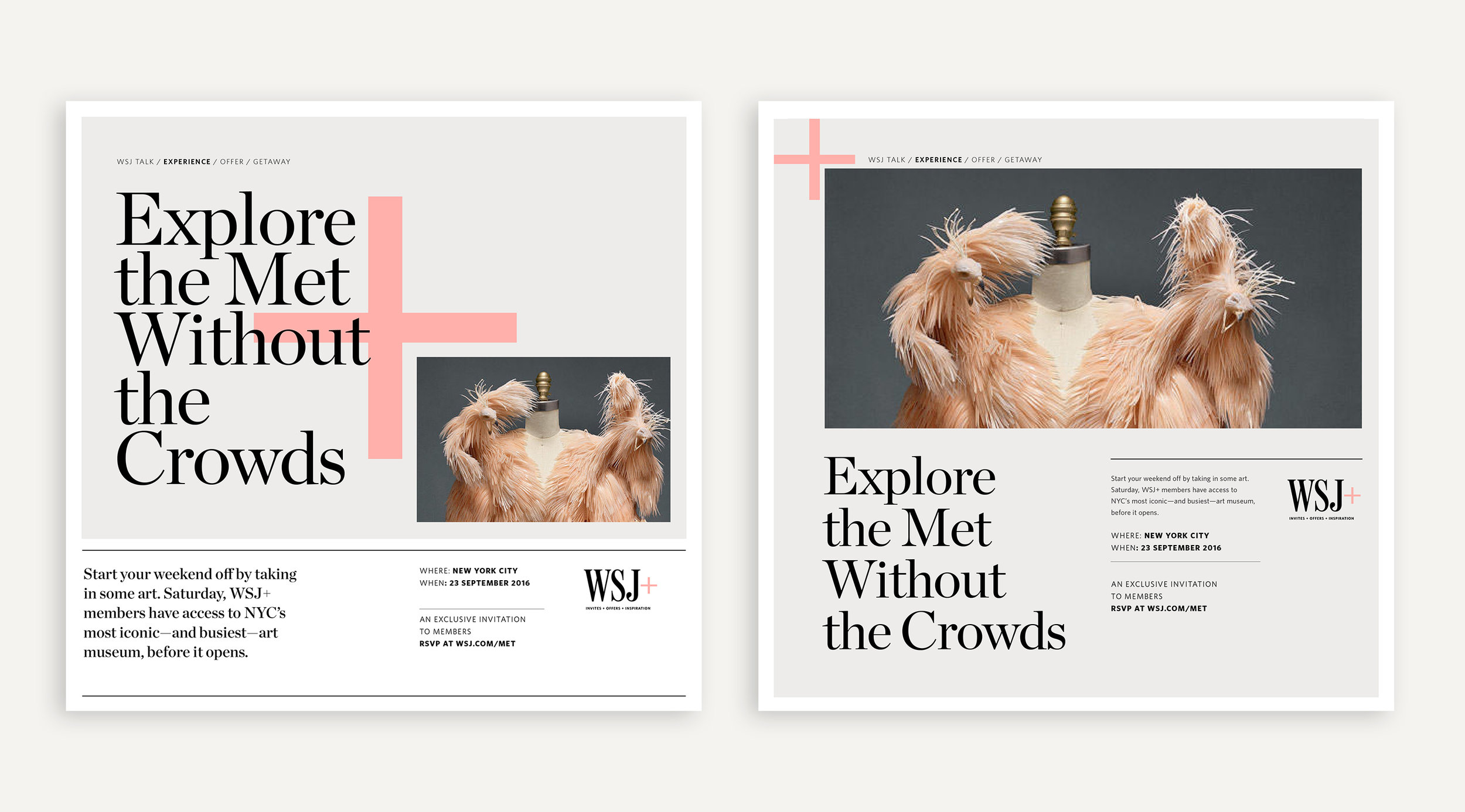
The Plus. While the plus mark already existed as part of the logo, we activated it conceptually as a bold graphic element. It can be used on its own, or to frame an image.


Layout Template. With ads running mostly in the Journal, we developed full, half and quarter page templates that can easily be edited for quick turnaround times. Each template has two versions — one with a focus on the image, and the other focused on the type and graphic for situations where image sourcing is an issue. The system also gives some flexibility to a previously rigid structure.

Monthly Calendar of Events.